如何在Python中使用Bokeh绘制多个图表
Bokeh是一个用于数据可视化的Python库。它使用HTML和JavaScript语言创建其图表,并且针对现代网页浏览器提供漂亮、简洁的图形构建以及高性能的交互性。
在本教程中,我们将学习如何使用Bokeh库在Python中绘制多个图表。我们将使用bokeh.layouts模块的row()函数,并将其传递给bokeh.io库的show()函数,以使用Bokeh库绘制多个图表。
语法:
show()函数的语法为:
show(row(fig1, fig2, fig3..... fign))
其中fig1、fig2、fig3等是bokeh.plotting模块中类figure的对象。
方法:
要在同一页上绘制多个图表,我们将使用以下方法:
- 步骤1: 导入所有所需的库和模块
- 步骤2: 指定坐标,然后使用figure类开始绘制图表
- 步骤3: 然后将figure对象作为row()函数的参数
- 步骤4: 最后使用show函数来显示row()函数返回的可视化输出
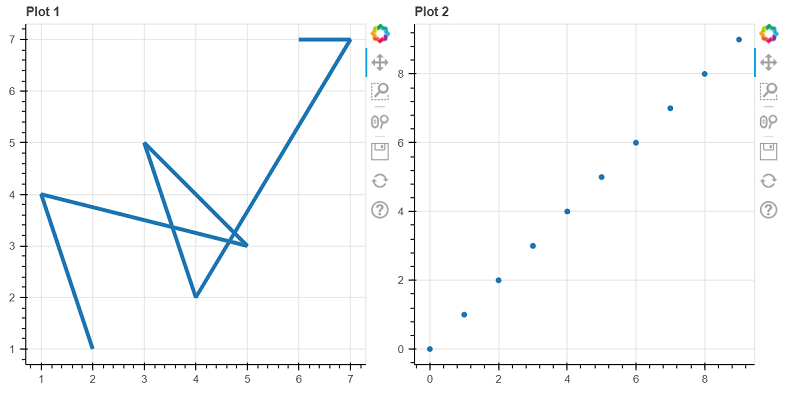
示例1:在同一页上绘制不同的图表
# First, we will import all the required libraries and modules
from bokeh.io import output_file as OF
from bokeh.io import show
from bokeh.layouts import row
from bokeh.plotting import figure as figs

# Now we will create a new plot
fig1 = figs(plot_width = 400,
              plot_height = 400, title = "Plot 1")
fig1.line([2, 1, 5, 3, 4, 7, 6],
          [1, 4, 3, 5, 2, 7, 7],
          line_width = 4)

# Then, we will create another plot
x = y = list(range(10))
fig2 = figs(plot_width = 400,
              plot_height = 400, title = "Plot 2")
fig2.circle(x, y, size = 5)

# depict visualization
show(row(fig1, fig2))
输出:

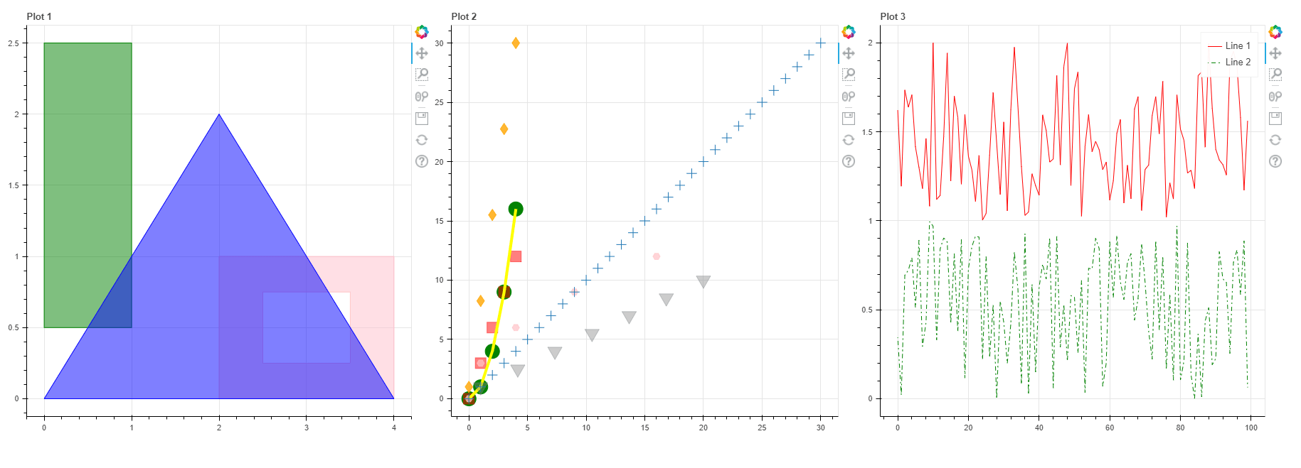
示例2:在同一帧中绘制不同的图形
# First, we will import all the required libraries and modules
from bokeh.io import output_file as OF
from bokeh.io import show
from bokeh.layouts import row
from bokeh.plotting import figure as figs
import numpy as nmp
import random as rdm


# Now, we will create a new plot
# instantiate the figure object
fig1 = figs(title = "Plot 1")

# coordinates
x1 = [[[[1, 2, 1, 0]]],
     [[[2, 4, 1, 2], [2.7, 2.4, 3.4, 3.1]]],
     [[[3, 1, 2]]]]
y1 = [[[[3.5, 2.5, 2.5, 3.5]]],
     [[[1, 1, 2, 3], [1.75, 2.25, 1.25, 2.75]]],
     [[[2, 1, 3]]]]

# Now we will give the color values of the poloygons
color1 = ["GREEN", "ORANGE", "BLUE"]

# filling the alpha values of the polygons
fill_alpha1 = 1.5

# Now, we will plot the graph
fig1.multi_polygons(x = x1, y = y1,
                    color = color1,
                    fill_alpha = fill_alpha1)


# Then, we will create another plot
# coordinates
x2 = nmp.arange(4)
y2 = x **2
z2 = x *3
p = nmp.linspace(2, 22, 5)
q = nmp.linspace(2, 12, 5)
r = nmp.linspace(2, 32, 7)
a = nmp.arange(34)

# Here, we will create an empty figure with specific plot width and height
fig2 = figs(title = "Plot 2")

# Then, we will plot the points in the form of circular glyphs
fig2.circle(x = x2, y = y2, color = "YELLOW", size = 20)

# Now, we will plot the points in the form of square glyphs
fig2.square(x = x2, z = z2, color = "GREEN", size = 12, alpha = 1.5)

# plot the points in the form of hex glyphs
fig2.hex(y = y2, z = z2, color = "Pink", size = 12, alpha = 0.7)

# now, we will draw a line between the plotted points
fig2.line(x = x2, y = y2, color = "grey", line_width = 4)

# plot the points in the form of inverted triangle glyph
fig2.inverted_triangle(p = p, q = q, color = "Green", size = 22, alpha = 0.4)

# plot the points in the form of diamond glyphs
fig2.diamond(x = x2, r = r, color = "RED", size = 16, alpha = 0.8)

# plot the points in the form of cross glyphs
fig2.cross(a = a, a = a, size = 14)


# creating a third plot
# generate the points to be plotted
x = []
y = []
for i in range(100):
    x.append(i)
for i in range(100):
    y.append(1 + rdm.random())

# parameters of line 1
line_color = "red"
line_dash = "solid"
legend_label = "Line 1"

fig3 = figs(title = "Plot 3")

# plotting the line
fig3.line(x, y,
          line_color = line_color,
          line_dash = line_dash,
          legend_label = legend_label)

# plot line 2
# generate the points to be plotted
x = []
y = []
for i in range(100):
    x.append(i)
for i in range(100):
    y.append(rdm.random())

# parameters of line 2
line_color = "green"
line_dash = "dotdash"
line_dash_offset = 1
legend_label = "Line 2"

# plotting the line
fig3.line(x, y,
          line_color = line_color,
          line_dash = line_dash,
          line_dash_offset = line_dash_offset,
          legend_label = legend_label)

# depict visualization
show(row(fig1, fig2, fig3))
输出:

示例3:在一行中绘制多个图
# First, we will import all the required libraries and modules
from bokeh.io import output_file as OF
from bokeh.io import show
from bokeh.layouts import row
from bokeh.plotting import figure as figs

# now, we will assign coordinates
x = y = list(range(10))
xs = [[[[1, 1, 2, 2]]]]
ys = [[[[4, 3, 3, 4]]]]

# creating a new plot
fig1 = figs(title = "Plot 1", plot_width = 250,
              plot_height = 250)
fig1.line(x, y, line_width = 25, color = "Orange")

# creating second plot
fig2 = figs(title = "Plot 2", plot_width = 250,
              plot_height = 250)
fig2.circle(x, y, size = 25, color = "Blue")

# creating third plot
fig3 = figs(title = "Plot 3", plot_width = 250,
              plot_height = 250)
fig3.square(x, y, size = 25, color = "Green")

# create forth plot
fig4 = figs(title = "Plot 4", plot_width = 250,
              plot_height = 250)
fig4.triangle(x, y, size = 25, color = "RED")

# creating fifth plot
fig5 = figs(title = "Plot 5", plot_width = 250,
              plot_height = 250)
fig5.multi_polygons(xs, ys, color = "Blue")

# creating sixth plot
fig6 = figs(title = "Plot 6", plot_width = 250,
              plot_height = 250)
fig6.line(x, y, line_dash = "dotted", color = "Green")

# depict visualization
show(row(fig1, fig2,
         fig3, fig4,
         fig5, fig6))
输出:

结论
在本教程中,我们讨论了如何在同一页面或框架上创建多个图。
 极客笔记
极客笔记